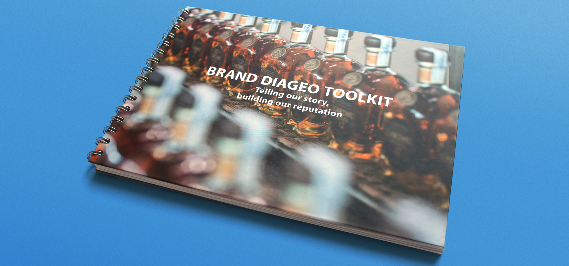
Diageo made the decision to change the way they talked about the business to their stakeholders and asked Ellipsis to help with invigorating and refreshing the current brand. Objectives: to create a more sophisticated and cleaner style, showcase the diversity and passion behind the brand through beautiful photography, create a more easily recognisable hierarchy of information, Diageo intranet to host all of the guidelines, tools and assets for easy download.
Our Insight
Our Strategic thinking
Diageo owns many of the world’s leading drinks brands, but as a brand in itself, Diageo needed to develop a strong and consistent contemporary visual style. Diageo needed help portraying its narrative and position itself as a brand in its own right. Diageo’s existing guidelines needed a refresh to create a stronger, cleaner, bolder brand, with an emphasis on clear and concise messaging. There was also a requirement for clear style guidelines and a facility to make assets available for everyone in one place.
Our Solution
Our Creative Execution
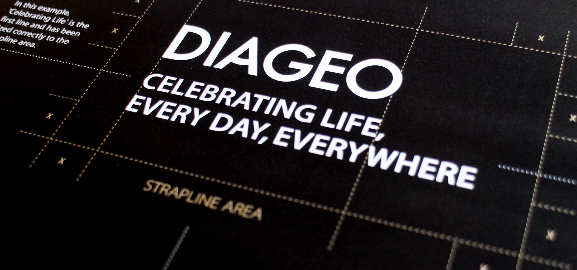
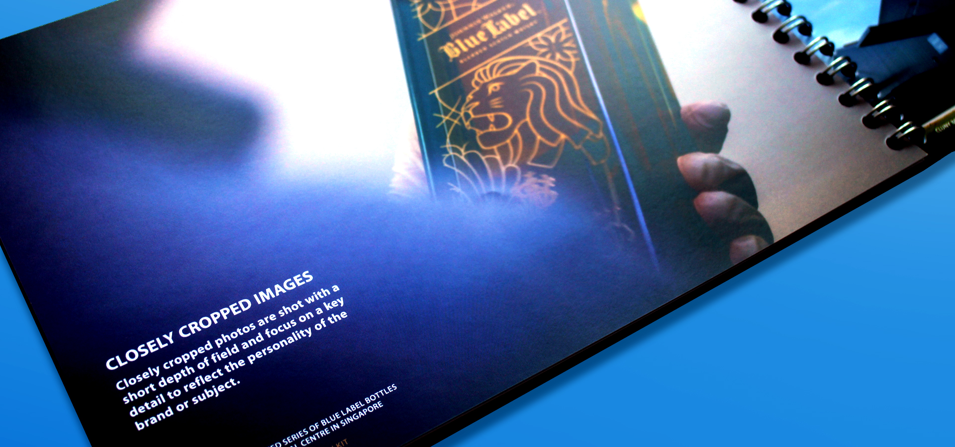
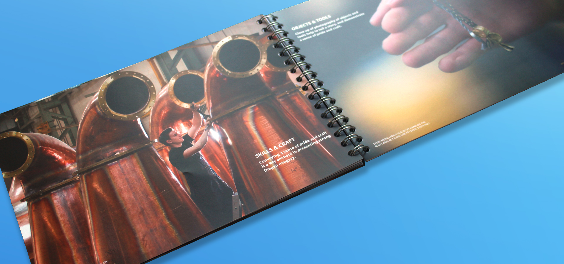
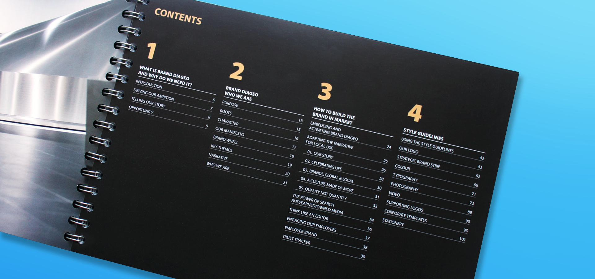
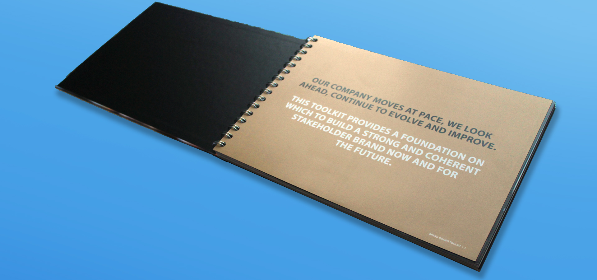
We began by developing a new brand identity, which included a refreshed colour palette, and guidelines on typography, photography and logo usage. In addition we helped to create a well-structured suite of assets including logos in all colours and formats, approved photography and editable templates. We then applied this visual style to a brand toolkit which portrayed Diageo’s history, narrative, and guidelines in a clear and compelling way.
The Results
The overall benefits
A strong, clear and consistent brand refresh that helps Diageo to be recognised and respected alongside other Diageo brands. A well designed printed and digital toolkit that contains everything about Brand Diageo in one easily accessible place. A well structured suite of assets and templates, hosted on the Diageo intranet for everyone to access.
